How an Interactive Campus Map makes your university more efficient, accessible and attractive
An interactive campus map at the intersection of 3 strategic priorities that universities are being asked to deliver simultaneously. Read on.
Universities invest heavily in research excellence, teaching quality, and campus infrastructure. Yet one of the most powerful signals a campus sends to prospective students, visiting families, staff and people with disabilities is often an afterthought: can you actually find your way around?
An interactive campus map is no longer a nice-to-have digital feature. It has become foundational to how modern universities operate, communicate and even compete. This article explores why: from the operational efficiency gains that matter to estates and facilities teams, to the inclusion and accessibility imperatives that no institution can afford to ignore, to the enrollment and brand differentiation opportunities that keep marketing teams up at night.
Why opting for an interactive campus map today?
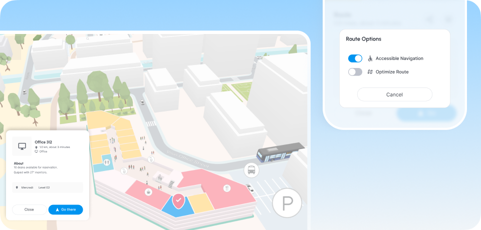
Before going further, it's worth being precise: an interactive campus map goes far beyond a static PDF floor plan or a Google Maps pin. It is a dynamic, web-based or app-embedded navigation layer that covers both the outdoor campus and the interior of every building (lecture halls, labs, offices, accessible entrances) and everything in between.
At its most capable, it offers:
- Turn-by-turn indoor and outdoor wayfinding, including mobility-adapted routes for wheelchair users and people with reduced mobility (PRM routing).
- Real-time information on room availability, building access hours and live occupancy.
- Multilingual interfaces for international students and visitors.
- Integration with timetabling systems, so a student can go from "my lecture is in Room G14" to a live walking route in seconds.
- An admin layer for facilities teams to update content, alert on temporary closures and monitor usage analytics.
This is the technology stack that enhances a digitized campus experience. And it sits at the intersection of three strategic priorities that university leaders are currently being asked to deliver simultaneously: the operational case, the accessibility requirement and the attractiveness lever.
The operational case: running a campus more efficiently
Campus operators and estate managers are under pressure to do more with less. Buildings are expensive to run, some spaces are chronically underutilized.
📊 Space utilisation and intelligence
Here is where the operational value becomes genuinely strategic. When a map is connected to room booking and occupancy systems, every interaction becomes a data point. "Which buildings generate the most navigation queries? Which routes are never used? Which accessible entrances are most in demand?"
This intelligence feeds directly into estate planning decisions: from where new signage is actually needed to how space allocation should evolve as hybrid classes and flexible teaching change footfall patterns.
🚨 Emergency and maintenance workflows
A dynamic map layer also supports operational resilience. When a lift is out of service, a map update alerts instantly and alternative accessible routes surface automatically. When a maintenance team needs to reach a specific plant room or electrical cupboard, they navigate via the same system. During an emergency, evacuation routes and emergency gathering points are surfaced in real time. And people guided them to reach them via the most adapted and quickest route. Something static signage could never do.
The accessibility requirement: inclusion is infrastructure
Accessibility in higher education has moved decisively from aspiration to legal obligation. In the UK, the Public Sector Equality Duty requires universities to actively remove barriers for disabled people. In the US, ADA Title II places equivalent demands on public institutions. In Europe, the European Accessibility Act extends digital accessibility requirements to a growing range of services. And campus navigation is firmly within scope.
♿ PRM routing: the feature that changes everything for mobility-impaired users
For a student with reduced mobility (PRM) using for instance a wheelchair, the experience of navigating a traditional campus can be exhausting and humiliating in equal measure. A route that takes an ambulant student three minutes might require a mobility-impaired student to navigate to an entirely different building entrance, take a service lift, and double back with none of this communicated in advance.
Adaptive and multi-modal routing changes this. An advanced university map with PRM-aware pathfinding like Visioglobe one calculates and displays routes that are genuinely accessible: step-free throughout, avoiding temporary closures of lifts or ramps and updated in real time when infrastructure is unavailable.
This matters beyond compliance. It sends a message about institutional culture that prospective disabled students, their families and disability advisors definitely notice and don't forget.
🌐 Language accessibility and international students
Accessibility is not only about physical mobility. For an international student arriving on campus for the first time — possibly in a country whose language they are still learning — a map that operates only in the local language is itself a barrier.
Multilingual interactive maps (supporting the most common languages among a university's international student cohort) reduce anxiety, improve orientation outcomes and, last but not the least, demonstrate that the institution has genuinely thought about the experience of arriving as an outsider. In other words, it is a small feature with an outsized symbolic impact.
The attractiveness lever: campus experience as a competitive asset
University marketing teams are increasingly being asked to demonstrate ROI on campus investment and to differentiate their institution in a market where prospective students have more information and more choice than any previous generation.
The campus experience and the messages it vehicles during open days and virtual discovery, have become a genuine differentiator.
🎒 Open days: the moment that decides enrollment
An open day visit is often the decisive moment in a prospective student's journey. Research consistently shows that campus feelings — the subjective, hard-to-quantify sense of whether a place is welcoming, navigable and human — correlates strongly with the final enrollment decision.
An campus map deployed for open day visitors does several things at once:
- It eliminates the friction of getting lost which, for a prospective student already nervous about the visit, can be enough to turn an impression negative;
- It showcases the university's digital maturity;
- It gives visiting families enough confidence to explore at their own pace, rather than being pushed through a prescribed tour route.
💻 Virtual discovery and the remote applicant
Not every prospective student can visit academic buildings before applying. International applicants, students from lower-income backgrounds and those with caring responsibilities may make their entire enrollment decision based on what they can discover remotely.
An embedded interactive map on the university website — one that lets a prospective student explore the library, locate the student union or check the route from their potential halls to their department — bridges that gap. It makes the campus real before they arrive.
This is also an SEO and engagement signal: time-on-page, interactive engagement and reduced bounce rates improve organic search performance for the university's own digital presence against competitors.
🤳 Signaling digital maturity to Gen Z
The students entering higher education today have grown up with Google Maps, indoor mall navigation and real-time transit apps. A campus that hands them a printed map during freshers week is communicating something about its relationship with technology and innovation — and not in a positive way.
Whereas a university that offers a genuinely functional, well-designed interactive campus map is communicating that it understands how this generation navigates the world and has purposedly invested in meeting them there. It may seem a small but really powerful signal, that has actually a significant effect on institutional brand perception.
Ready to see what this looks like in practice?
Whether you're exploring options or ready to move, talking to an expert team that has already deployed interactive maps across large universities and campuses is the fastest way to understand what's possible — and what matters most for your institution's specific context.